Research, Concept, Wireframing, Design, Prototype

Airbnb Redesign

January 2017
Personal Design Exercise within 1 week
Keywords: Airbnb Experience, Mobile App, Traveling Experience, Redesign

OVERVIEW

This redesign was done for KPCB’s 2018 Design Fellows application. I selected a deadline of one week to offer a simple redesign of Airbnb’s Experience feature, in which I attempted to improve its interface and enhance the user’s journey.

Within the intense timeframe, I interviewed 10 frequent travelers, and 60% have used the app previously. I focused on mobile because I found most people browse the experiences on their mobile devices.

Solution Overview

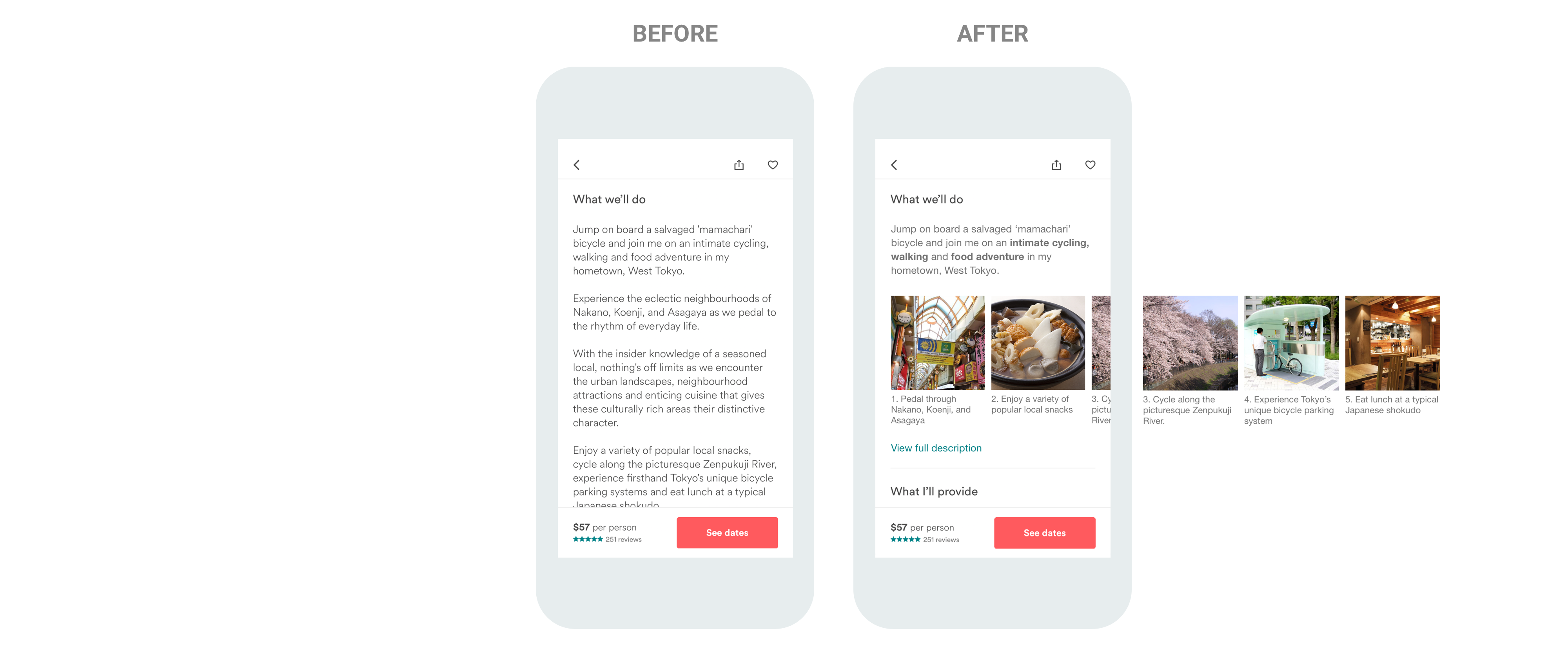
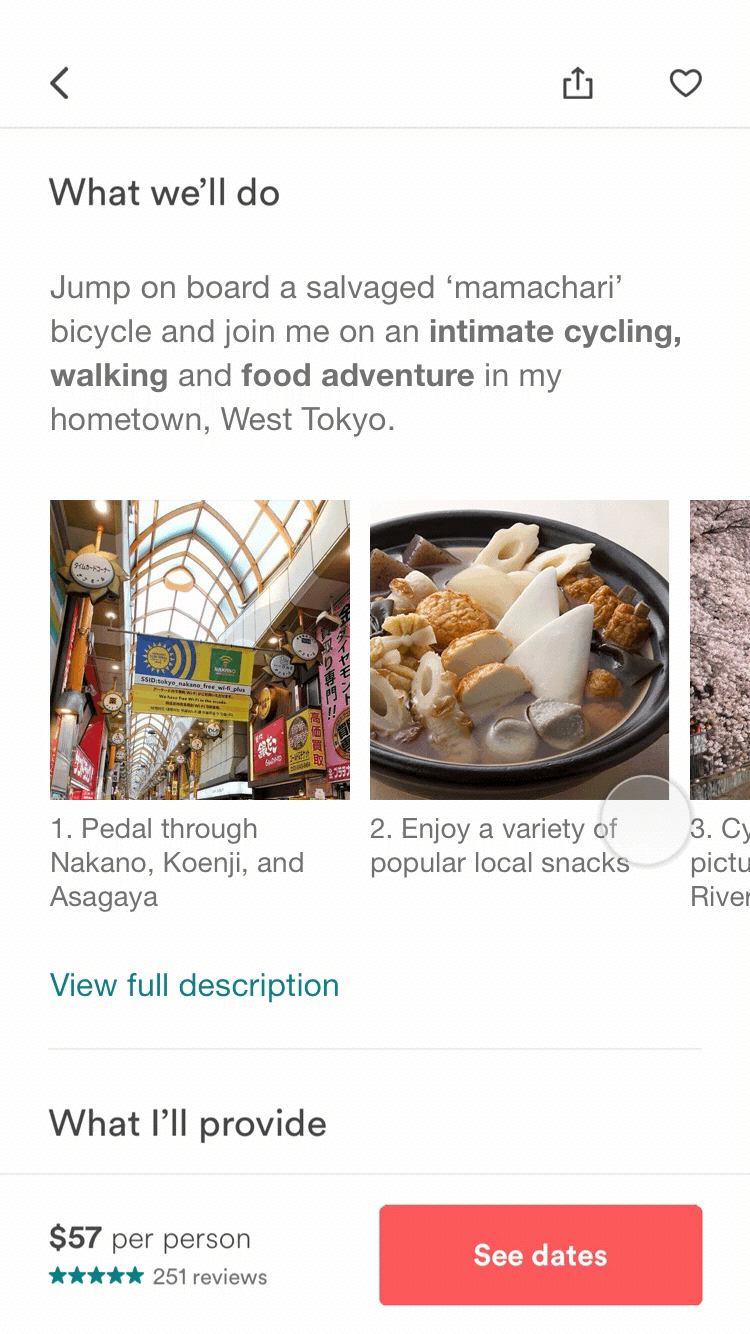
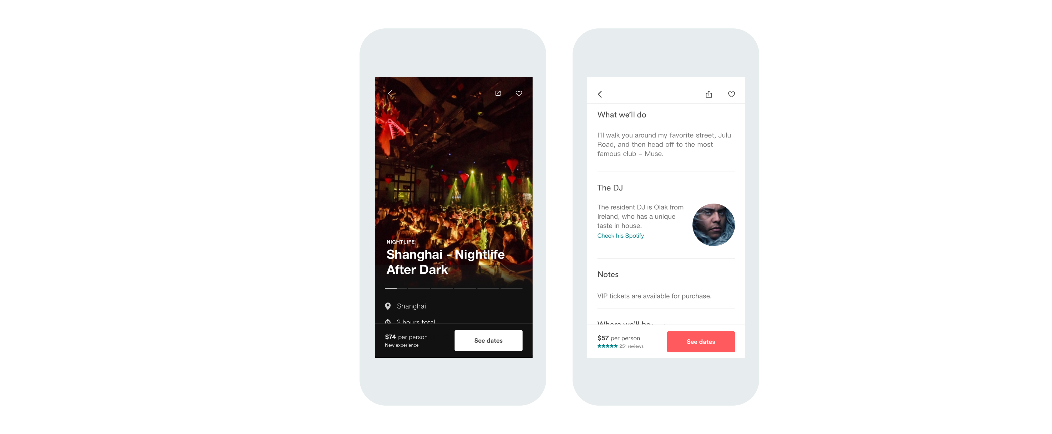
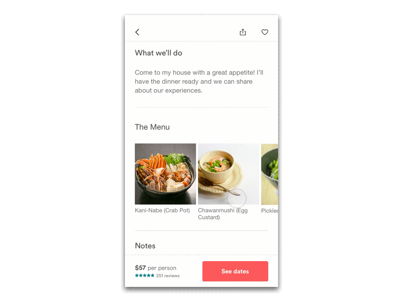
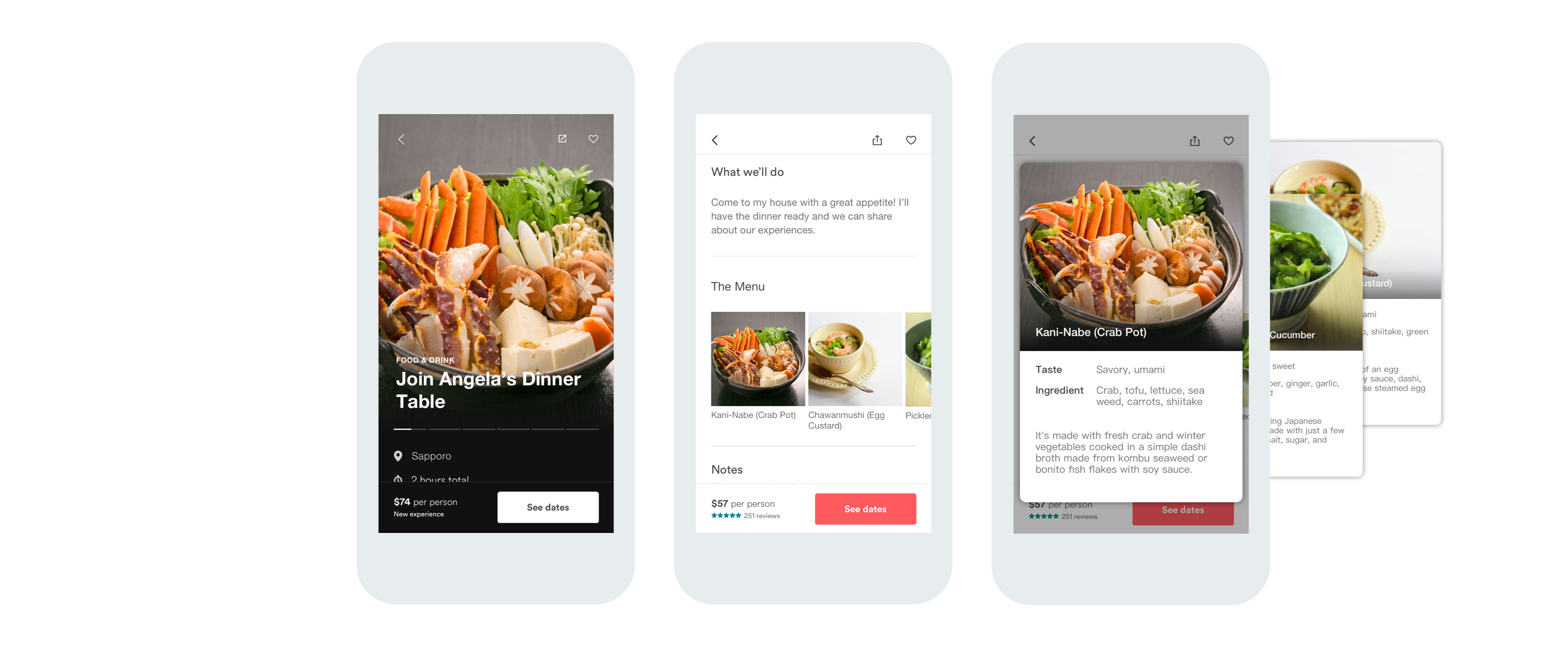
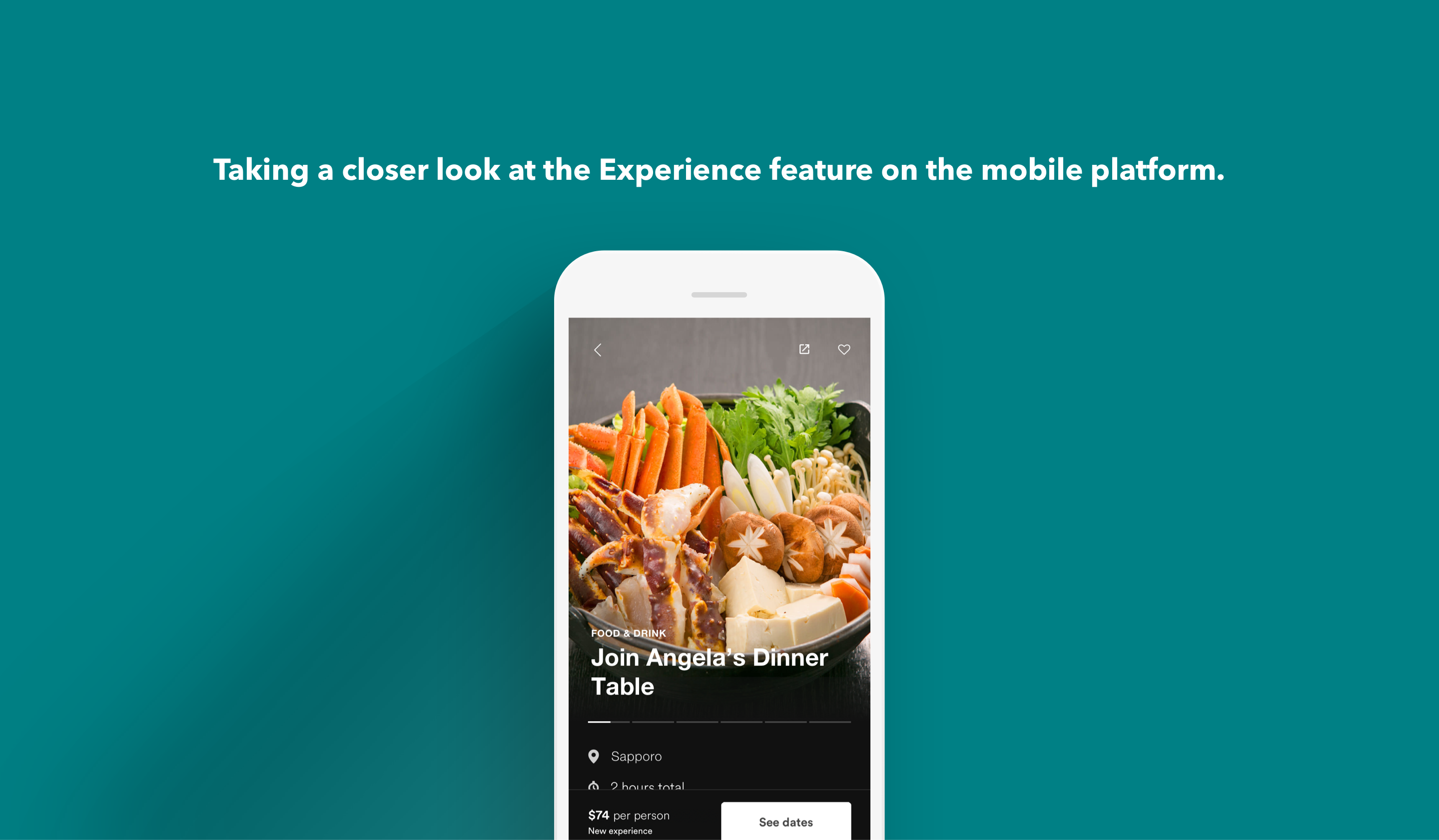
1. Improve activity showcase page by increasing the amount of visuals and using more a dynamic description framework.
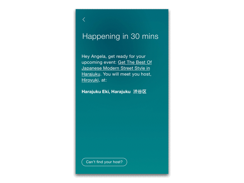
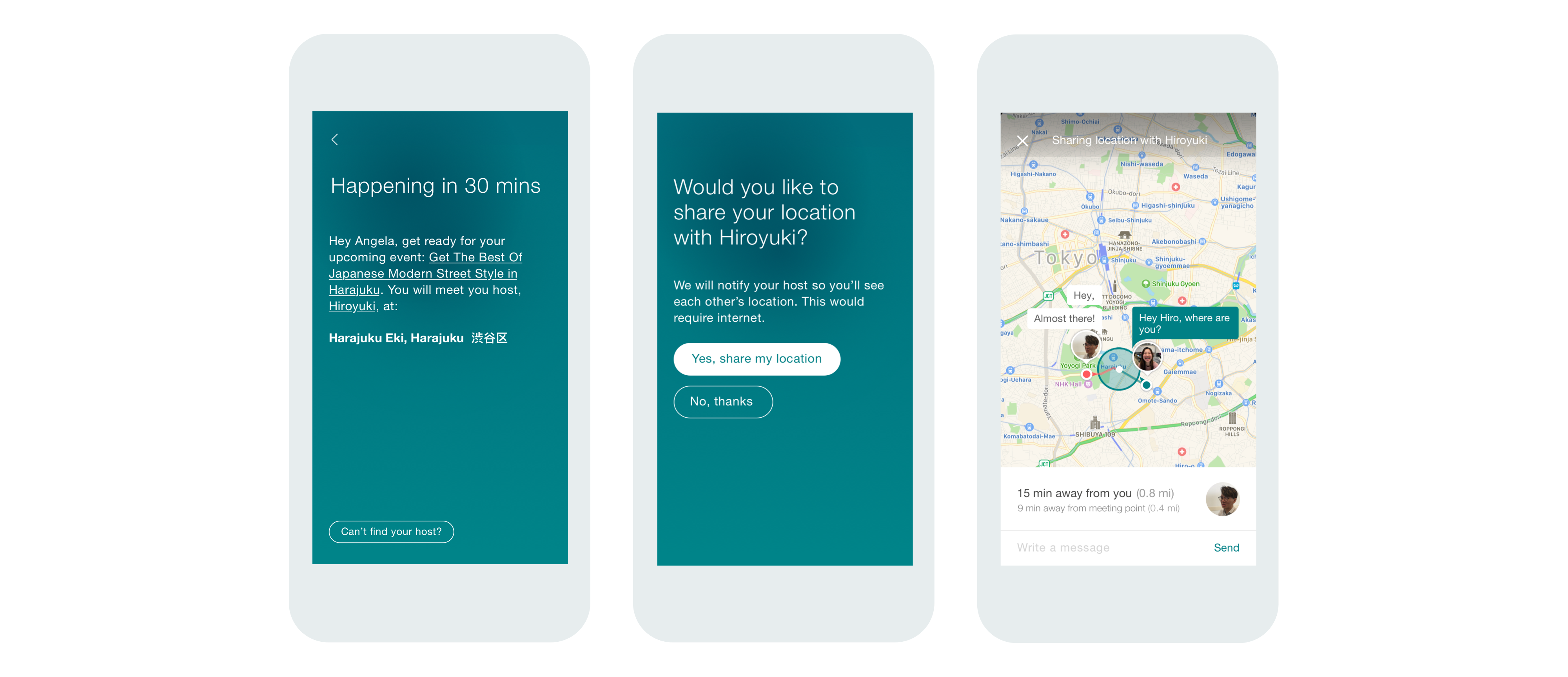
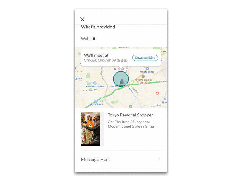
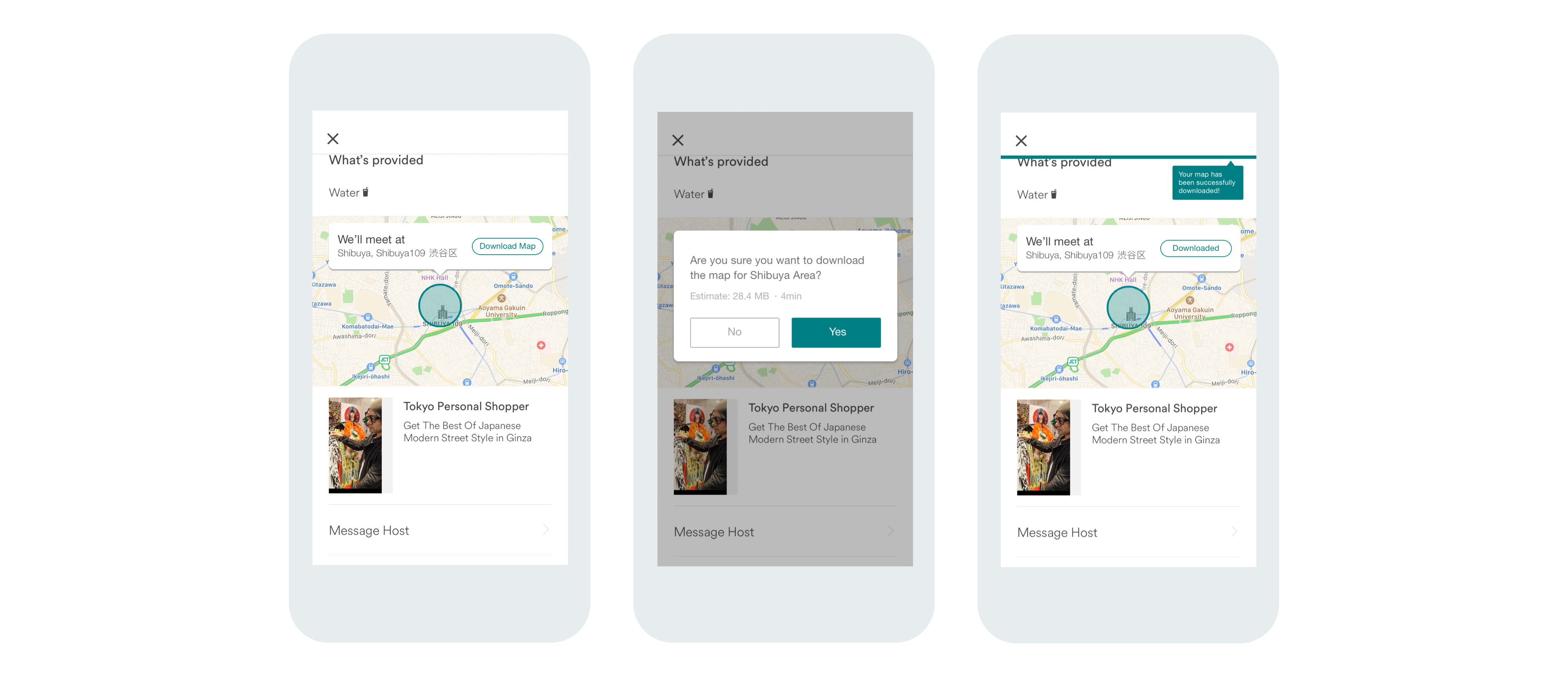
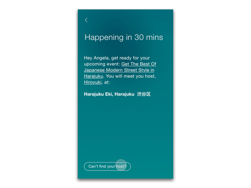
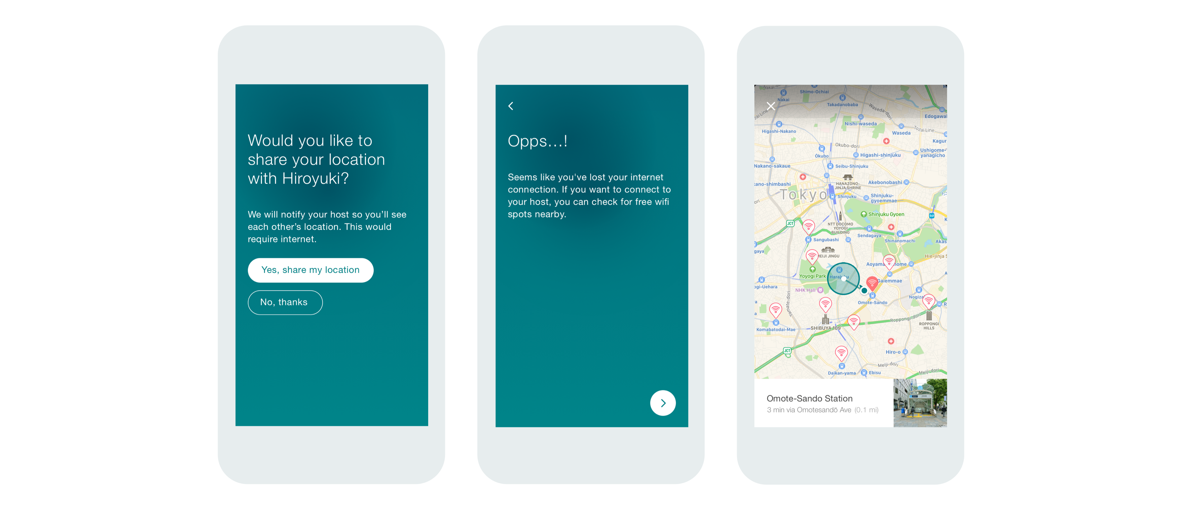
2. Enhance the experience of meeting up the host under different situations.

RESEARCH

Among the people who have used Airbnb previously, only 1/3 had tried out (or want to try) Airbnb Experience, why?

Airbnb Experiences are excursions or activities designed and led by local hosts. Although the level of comfort to interact with locals guides differs within individuals, I was especially interested in why many people are hesitant about trying out this awesome feature. I mapped my research using two methods:


1. interviewing experienced user with carefully-designed questions, and
2. conducting user observation on newbies and analyze their behaviors.

Although the existing Airbnb App is well-designed and highly usable, I still received a wild range of feedbacks which can be leveraged to make the app even better. I summarized people’s complains into 2 main symptoms, and provided solutions for each, while having an overarching goal in mind – encouraging more people to opt in the Airbnb Experience.

SYMPTOM 1

Text-heavy activity description

Nearly all interviewees, regardless have or haven’t used the Experience feature before, complained that “What we’ll do” is too long and hard to read. For first-time users this section tends to be easily ignored. Current page design lacks of efficient ways to present the product, or the activity’s process. Some experienced users also questioned what exact things would be involved in the experience (e.g, what kind of sushi are we making exactly?).

SYMPTOM 1 - SOLUTION 1

Breaking down the texts to visuals

Instead of reading paragraphs, the user can first skim over the overview, in which keywords are highlighted, and the tray of cards about major activities involved. Each caption summarized key steps happen during the experience. The user can also opt to view detailed description of the experience. (Funnily enough, as I coming up the solution, Airbnb actually updated the app where a similar feature was found.)

SYMPTOM 1 - SOLUTION 2

Customized description blocks

Current description of experience uses a framework that is shared across all categories (music, sports, technology, food...), in a way there is a lack of information for certain categories of events. I see the potential to give the host flexibility to offer specific descriptions target at the experience. The example shows the info about the DJ for the nightclub experience, by which users can gaze at his Spotify list to ensure they will like his taste.

Home dining experiences

This idea came from a previous research (see Lofo), in which I recognized that some travelers have the need to try out local’s HOME dish, while making new connections. 27% of my interviewees didn’t want to join a cooking lesson or food tour, rather they want to sit down and experience a real home dinner or lunch.
The menu is meant to give the user a clear idea about what exactly will be offered. Clicking on the dish card brings up a larger view filled with detailed information about the dish, its ingredient, taste, and a short intro.

SYMPTOM 2

The problem of meeting up the host

Three people in my interviews specifically brought up their frustrations with navigating the meeting point at a new place, especially when their data plans are strictly restrained. They also reported that it was an extremely hard and anxious experience to find the host in a public metropolitan settings, where they could get lost easily and sometimes run into the wrong person.


SYMPTOM 2 - SOLUTION 1

Live location share

If the user can't find the host, Airbnb offers a real-time location sharing feature. The host will be notified if the user has turned on this function, and under double consent, both will be able to see each other’s current location and communicate through sending messages.

SYMPTOM 2 - SOLUTION 2

Download the map before departure

What if the user is having a hard time accessing to the internet?
Before on boarding, where internet is accessible, the user can download the map package of the area to his phone. The progress bar located on the top of the app will not distract the user as he continues using the app.


Find free wifi spot using GPS

With the pre-downloaded map, the user can access to the map without using the internet. The map will offers him a list of nearby free wifi locations where he can quickly go in and contact the host for further instructions.